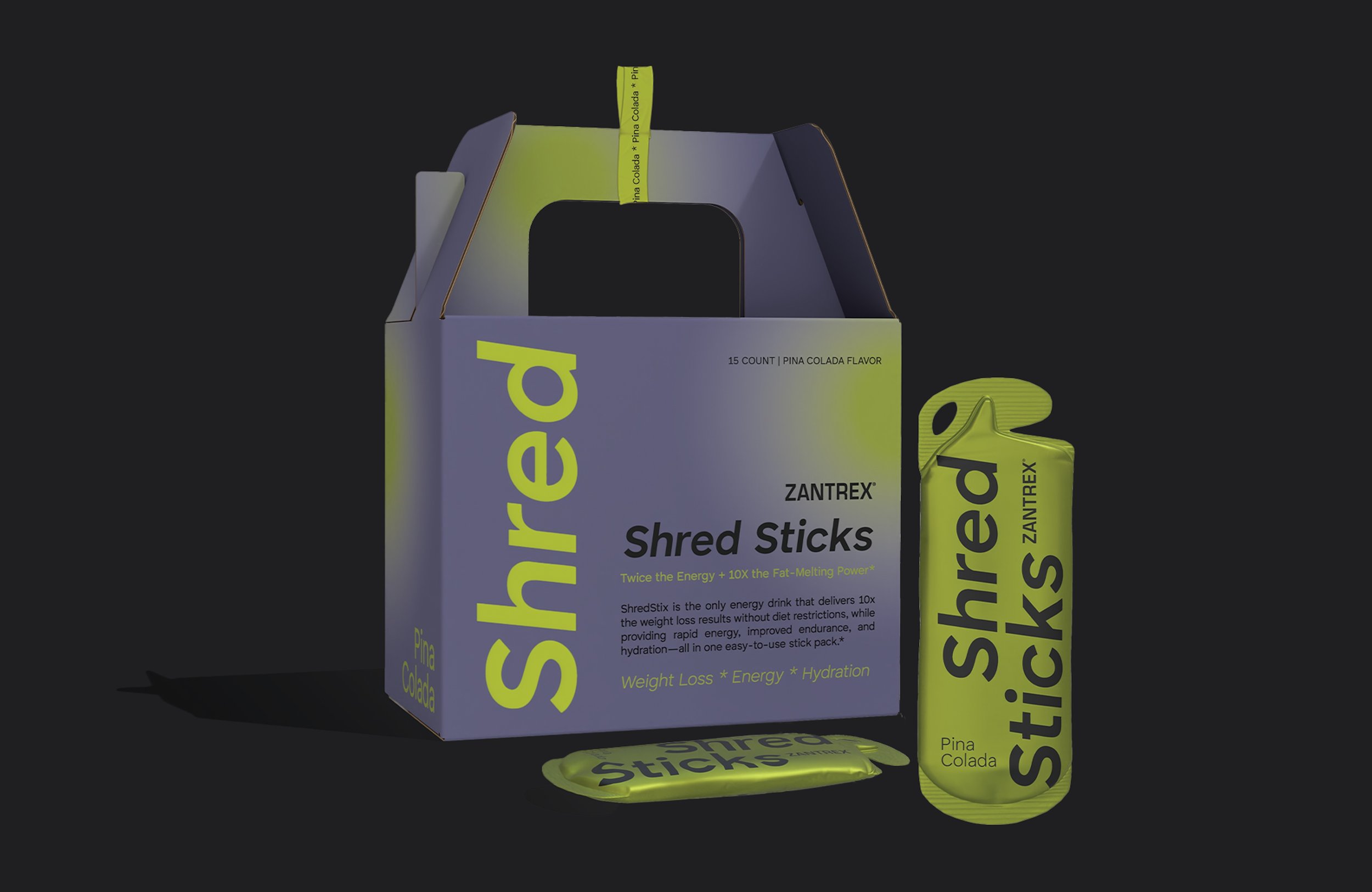
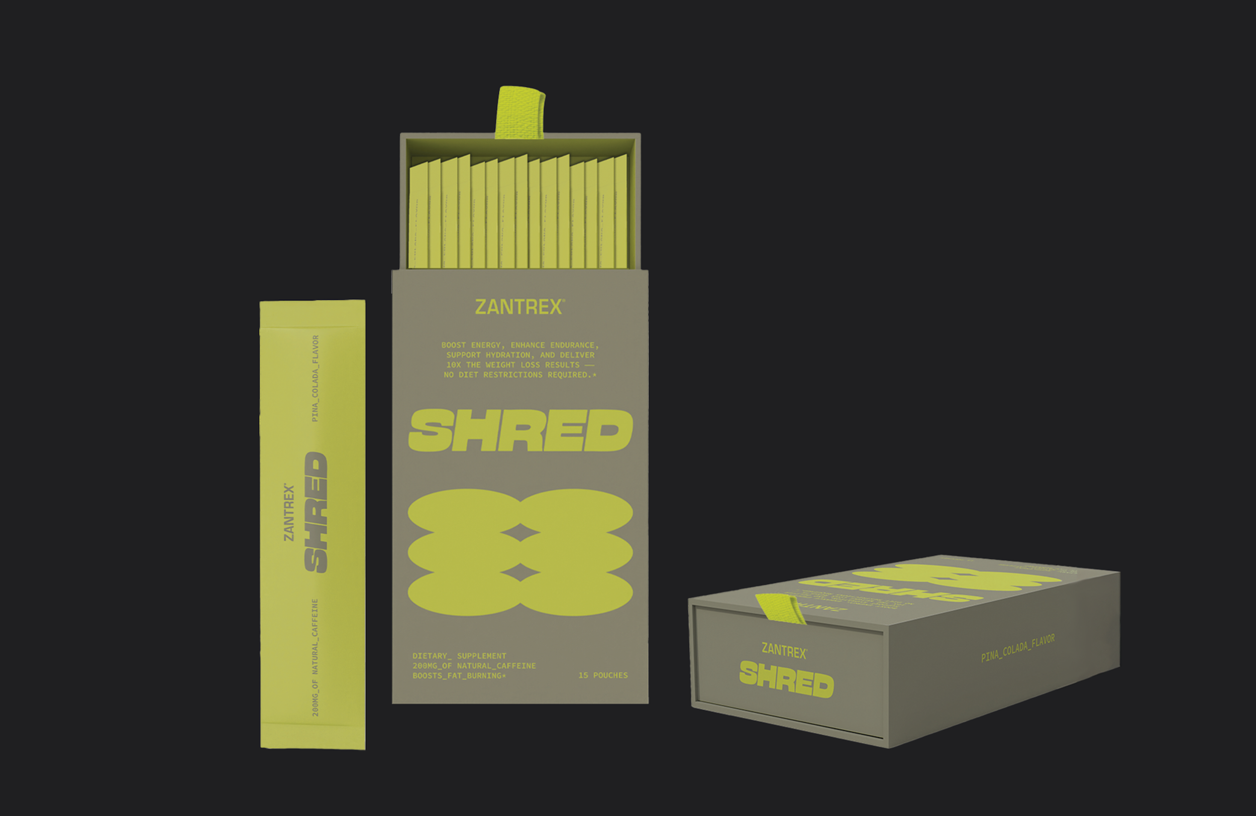
Shred Sticks
Weight loss Drink Mixer
Basic Reasearch
Website: www.basicresearch.org
-
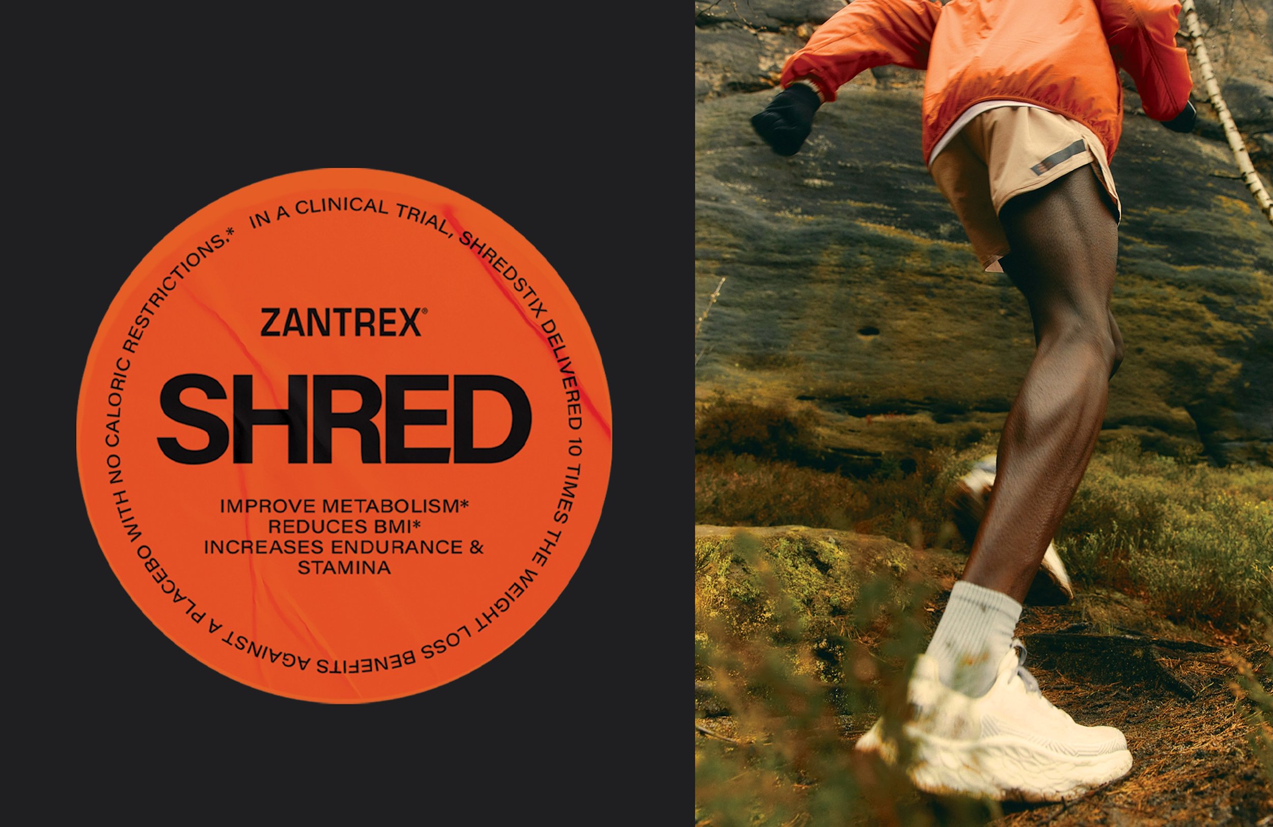
When Basic Research reached out, they were looking to explore bold and distinctive design directions for their new product, Shred Stick—a fat-burning energy drink powder mix targeted at men ages 20–40.
The design featured here is my favorite direction we explored together. It strikes a balance between high-impact energy and a modern, masculine edge—meant to stand out on shelves and speak directly to the product's core audience.
I've also included the other design options we considered. In total I crated 3 unique packaging designs, with 3 different brand directions that the client.
-
Before diving into new concepts, I began with a mini brand refresh—building upon Basic Readearch’s existing logo. Rather than starting from scratch, I expanded the visual language to create a more dynamic and versatile system. This included refining type choices, introducing bold color treatments, and exploring graphic elements that could scale across packaging, digital, and merch—laying the groundwork for a stronger, more cohesive brand presence.
-
While the initial copy provided by Basic Research was more directive, I made strategic, consumer-driven adjustments to better resonate with the target audience—men ages 20–40. For instance, rather than framing the product as a “weight loss drink,” I shifted the messaging toward a more performance-focused tone, highlighting fat-burning and energy-boosting benefits. These subtle yet impactful changes helped align the branding with the audience’s motivations and lifestyle, without losing sight of the product’s functional claims.