Junedays
Mineral Sunscreen
Personal Project
Website:
-
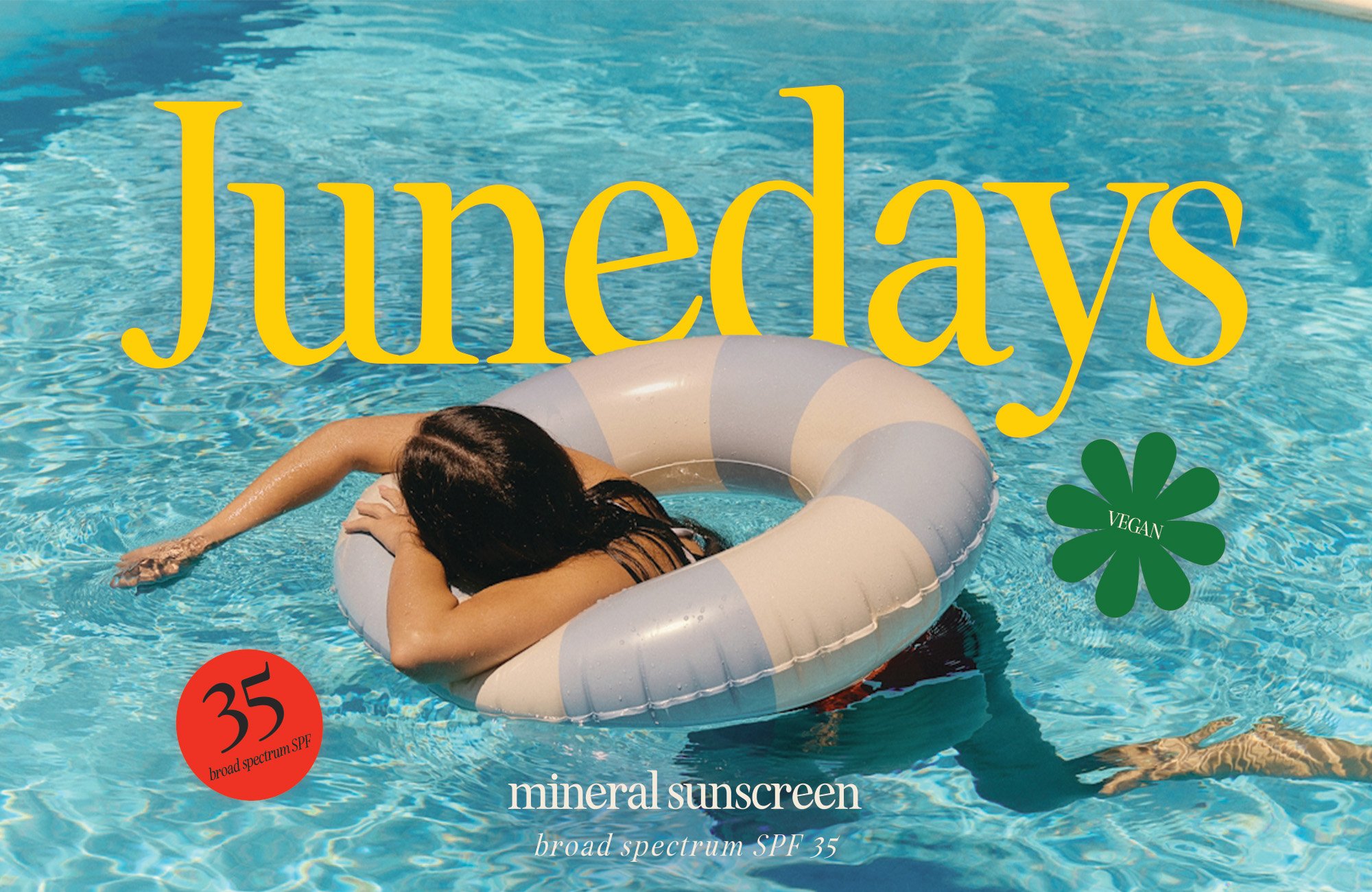
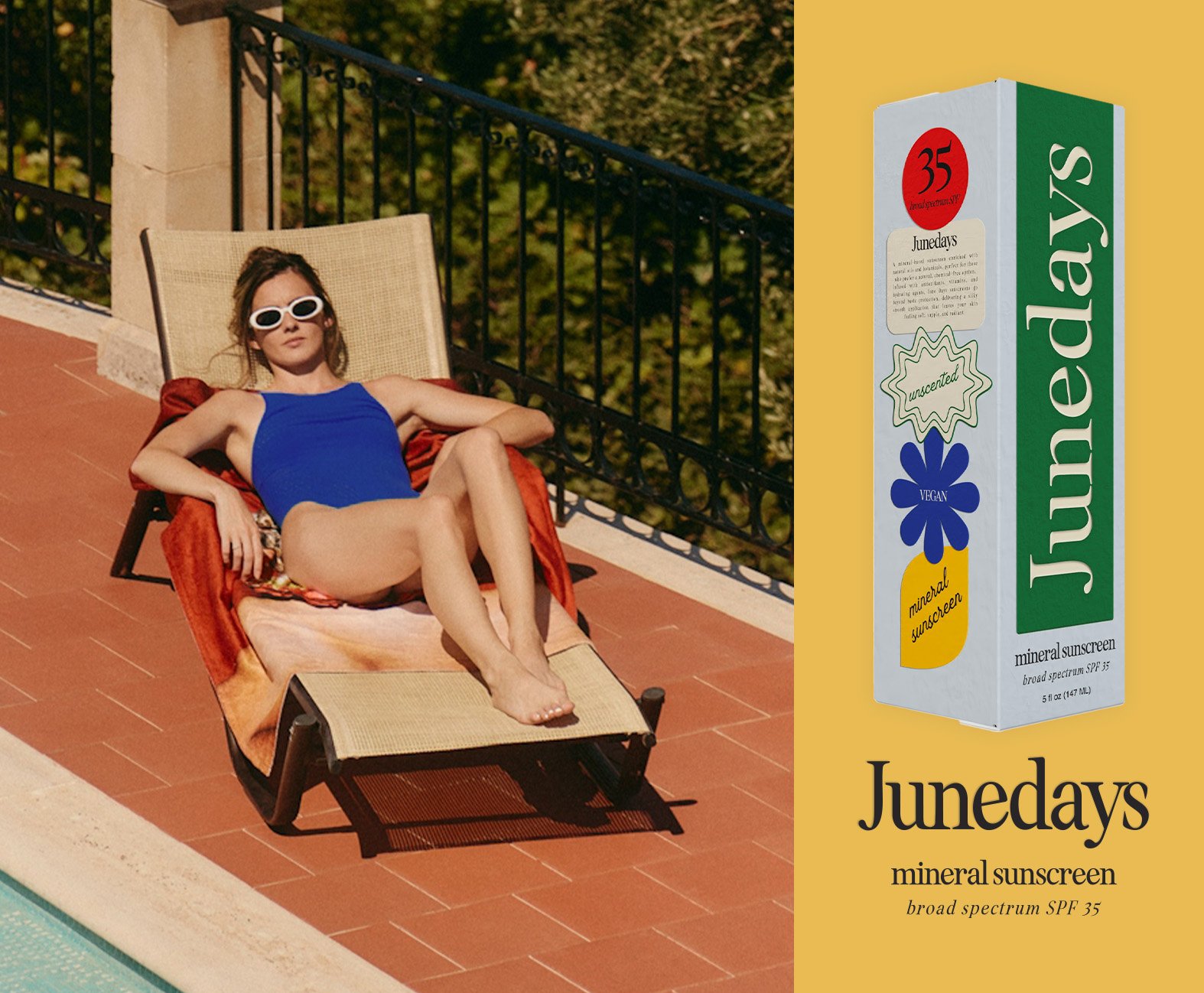
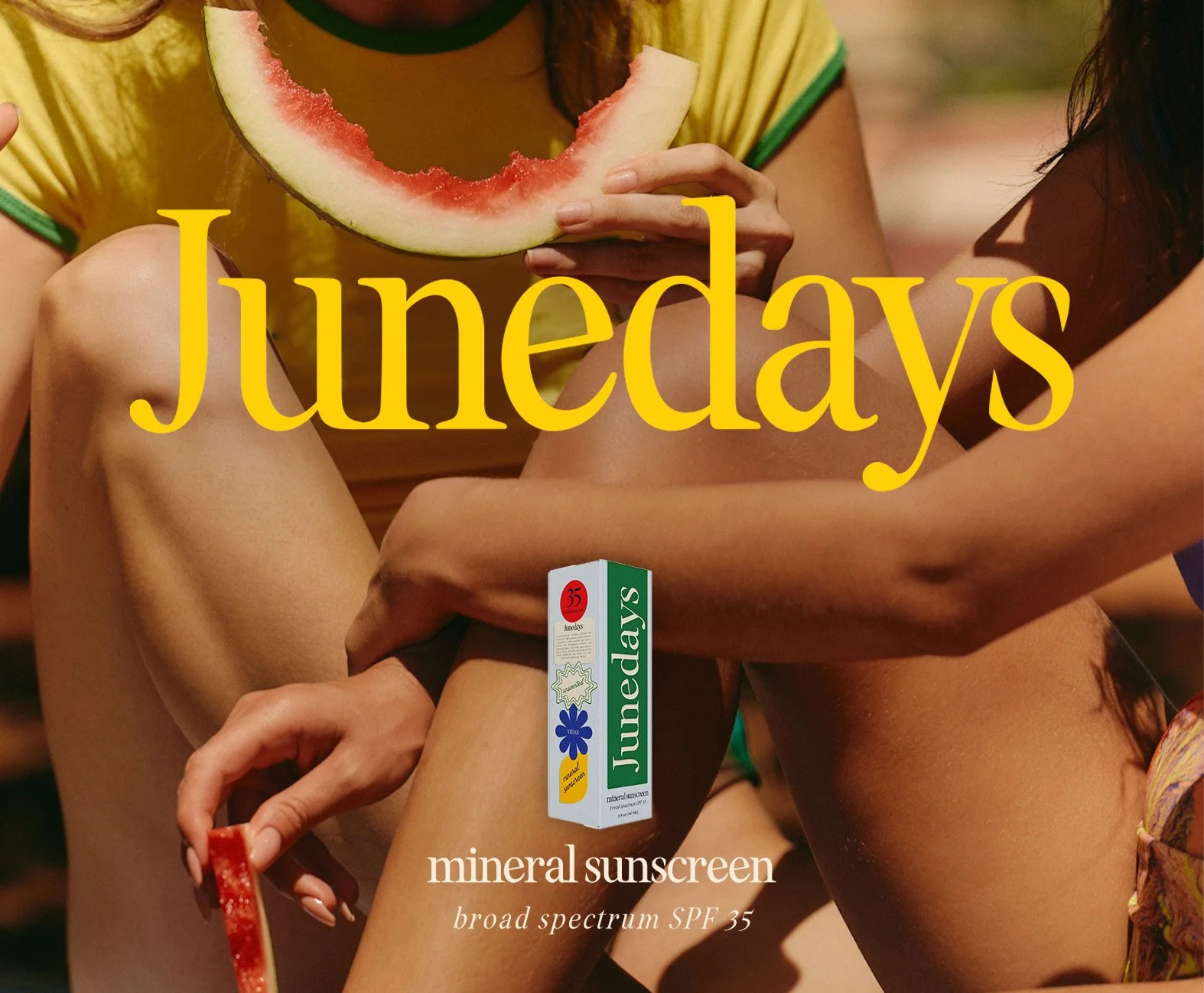
It all begins with an idea—and for Junedays, the spark was a desire to bring personality and heartfelt craft back into skincare. Inspired by the storytelling and artistry often lost in today’s minimal-wellness packaging, I envisioned a mineral sunscreen concept that could feel playful, intimate, and tactile. The goal was to speak to a wide spectrum of women—from teens just beginning their skincare journeys to those in their thirties and forties who value both efficacy and individuality. In a market dominated by generic neutrals and perfection-driven aesthetics, Junedays would offer a different invitation: one of warmth, surprise, and an unapologetically joyful approach to self-care.
-
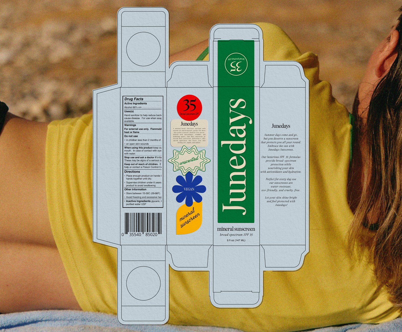
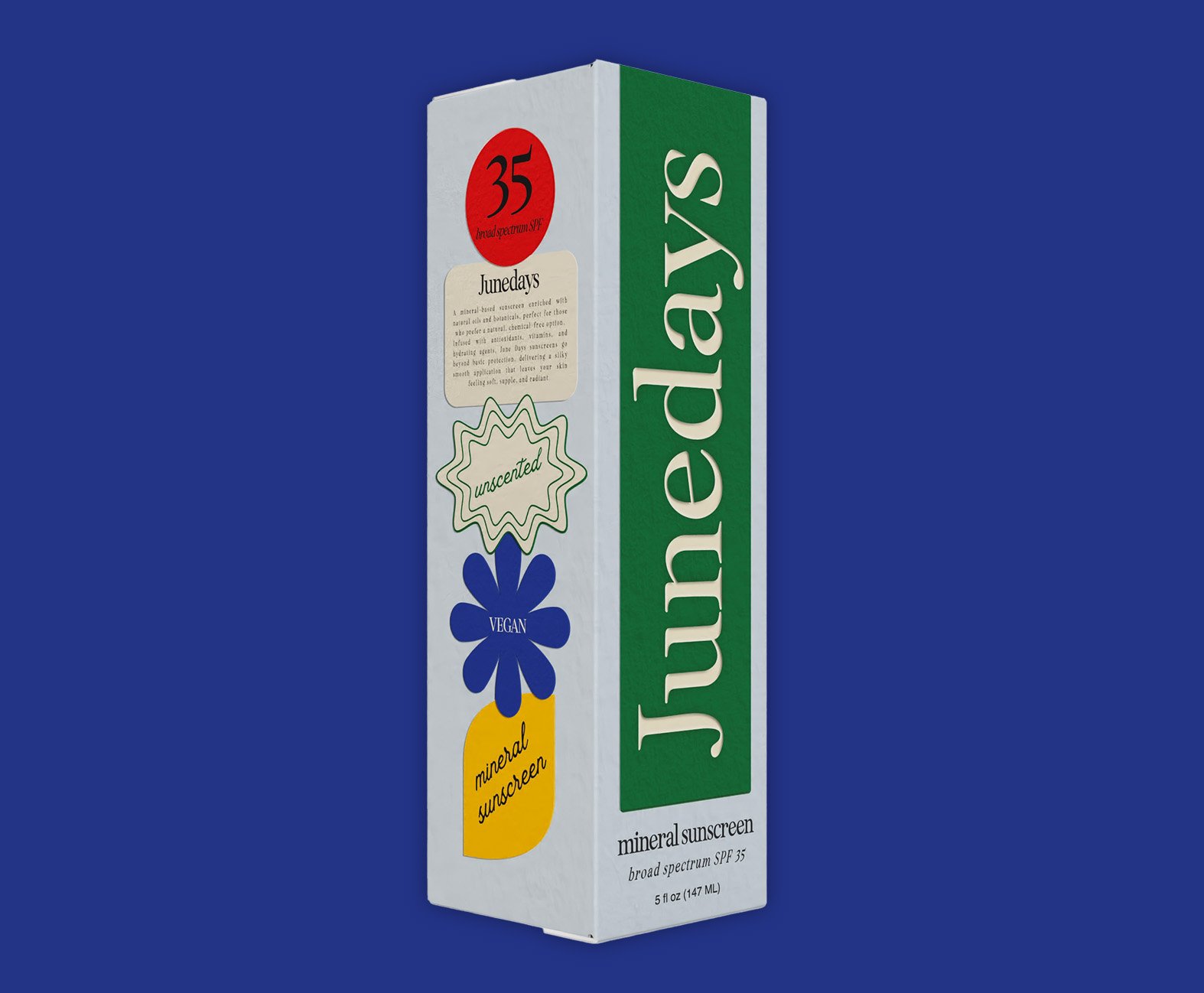
Once the concept was firmly rooted, I built a visual world that felt at once grounded and spirited. A palette of soft mineral tones serves as the base, while deliberate pops of color and hand-drawn motifs add energy and personality. The logo and type treatments mirror this balance: structured yet friendly, precise yet infused with life. Every visual decision—from the playful yet refined lettering to the accent graphics—was chosen to carry this duality across every touchpoint. Whether on social media, print, or in-store displays, the identity consistently signals that Junedays is a brand that knows how to take care of skin—and how to make it feel fun, too.
-
At the heart of the tactile experience is packaging that delights. I translated the playful spirit into custom-designed mineral sunscreen sticks—objects of both utility and discovery. The stick format invites interaction, turning application into a ritual: the satisfying click of the cap, the weight of the product in the palm, the gentle slide across the skin. They feel crafted, like small treasures that elevate daily routines into little celebrations. These sticks embody Junedays’ core promise: effective skincare wrapped in delight and intention, offering a moment of joy in every use.